- Recipe Index

- Photography

- The Photography Series: My Go-To Photoshop Routine
The Photography Series: My Go-To Photoshop Routine
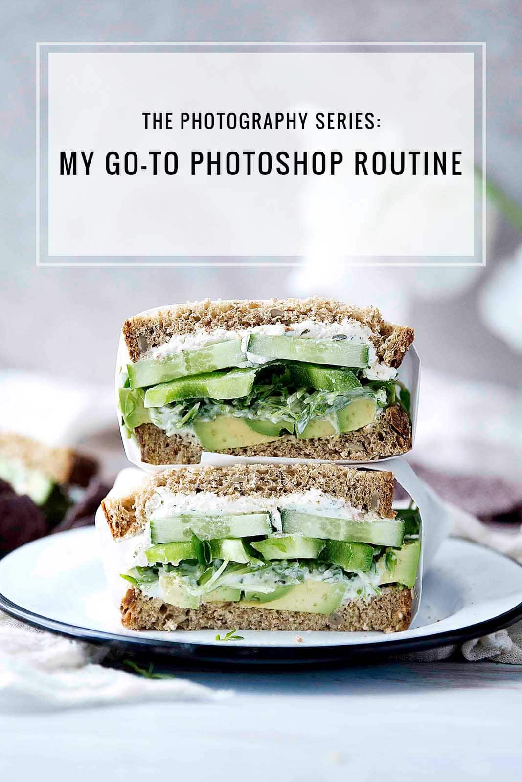
Welcome to a new series of posts devoted to my favorite thing: photography! We’re kicking it off with my go-to food photo photoshop routine.
There is one question I get asked constantly by bloggers and readers alike: how do you edit?
I’ve done a few posts on this subject in the past, but as the questions have kept coming in, I’ve realized I should do a series on this exact subject. So every few weeks, I’m going to post a new post, tutorial, or video on editing photos.
I firmly believe that editing can make or break a photo, especially in food photography where the eye judges the subject’s edible appeal just as much as it does the content. Making sure your image has appropriately edited exposure, saturation, and contrast means everything in food photography.
For this first post, I want to start simple. Let’s dive into my go-to routine for editing photos in Photoshop.
Be sure to hover over each image to see the before and after!
1. Adjust Levels
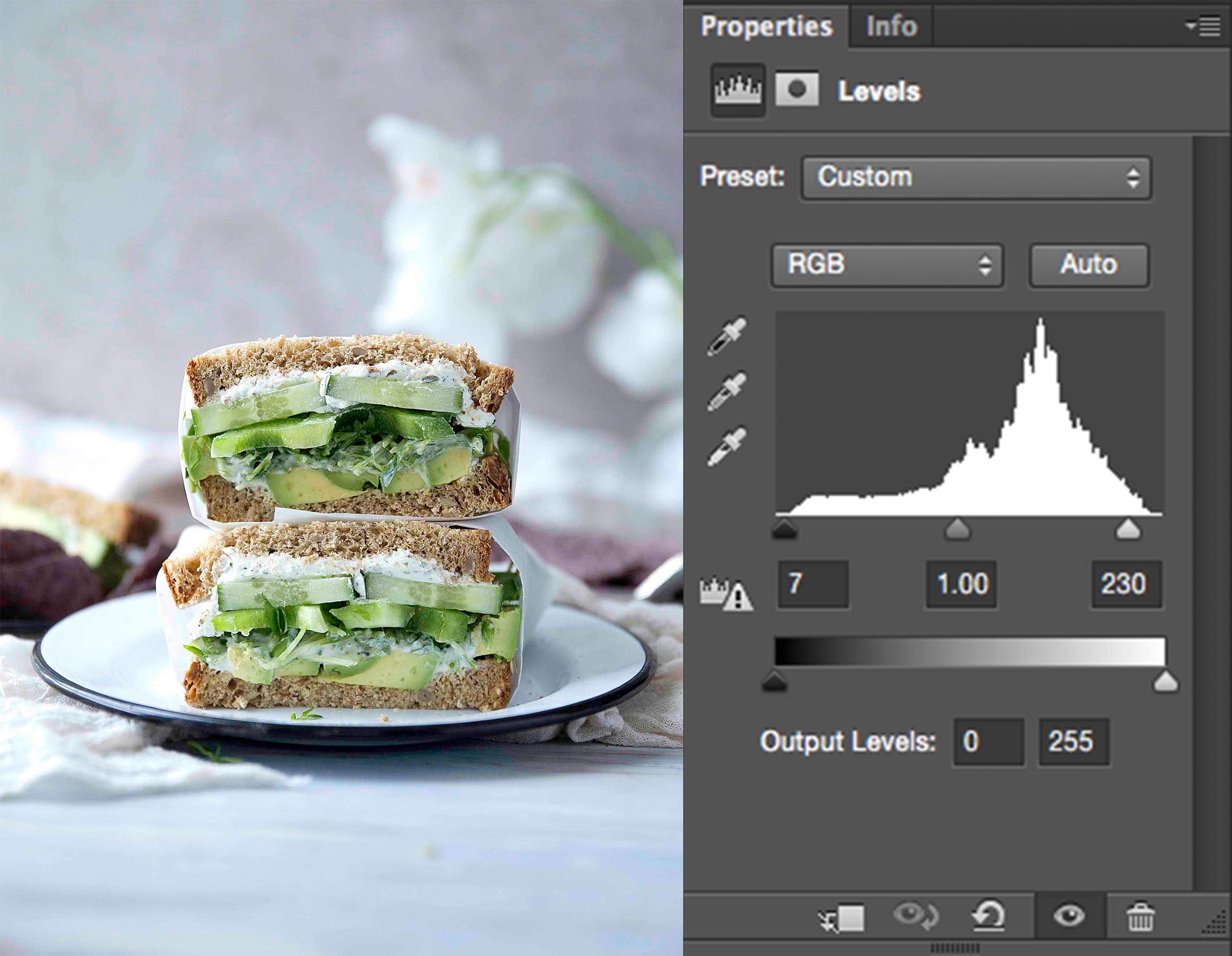
The histogram (that white mountain with tiny jaggedy spikes) above shows values of black to white on the X axis, and the amount each color exists on the Y axis. So when you adjust your Levels sliders (the little dudes at the base of the mountain), you’re telling Photoshop what brightness should be considered absolute white and absolute black.
Confused? Think of it this way. Every photo should have a little absolute white (AW) and absolute black (AB) in it (I didn’t decide this. It’s a well-known technique in photography called the Zone System).
But when you take a photo (of a sandwich, of your cat, etc) you don’t necessarily have AW and AB in that photo. So Your first step in editing should be adjusting so some AW and some AB exists.
Generally, you want to push the sliders sliiightly past the part on the X axis where the histogram begins and ends. In this image, I set my sliders to 7 and 230.
2. Add Lightening Curve
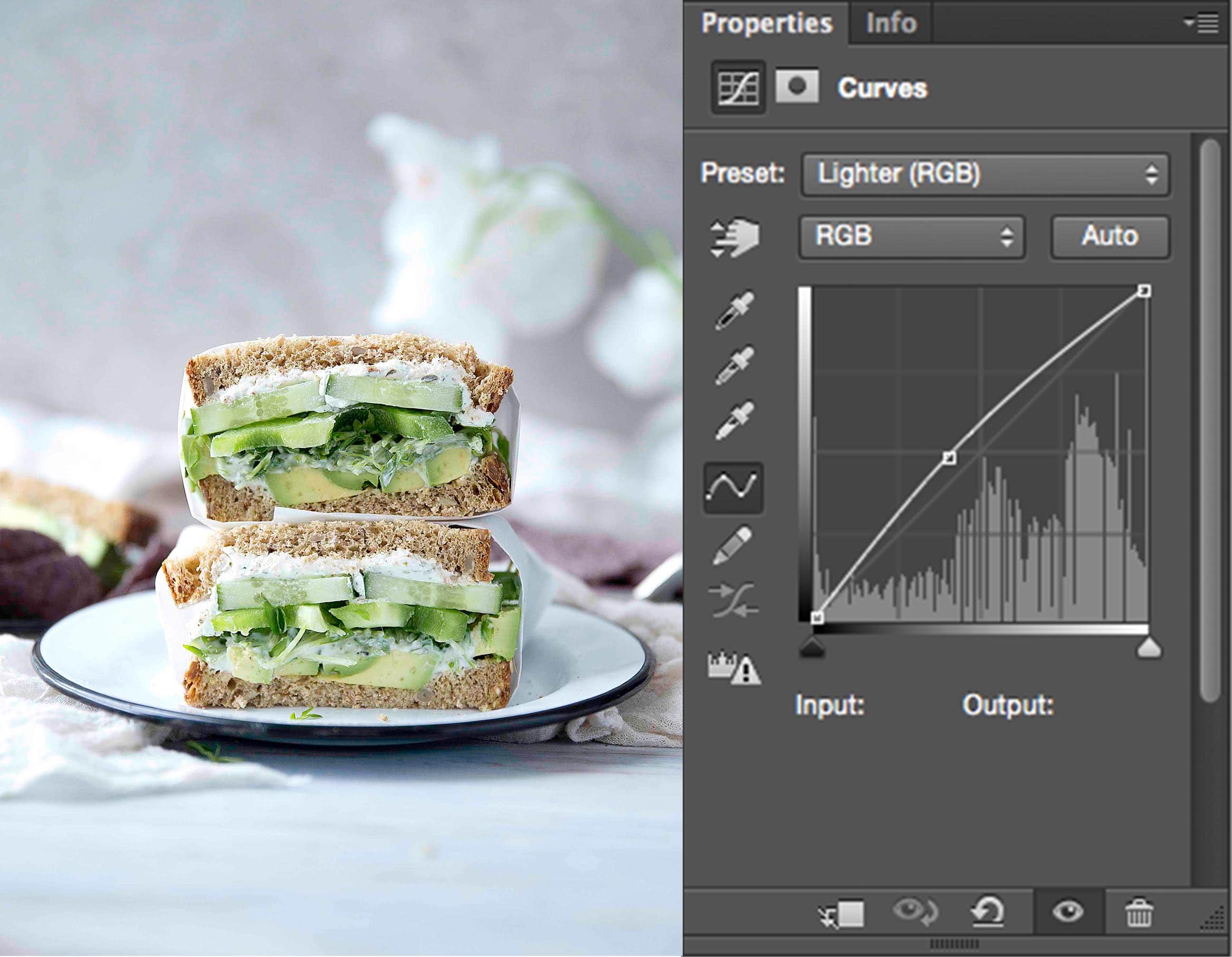
Next step is to lighten up our image. Click on the Curves widget, then in the dropdown menu, select “Lighter.”
This boosts the brightness in our image, concentrating on the middle values of our image for a nice, natural look.
3. Add Contrast Curve
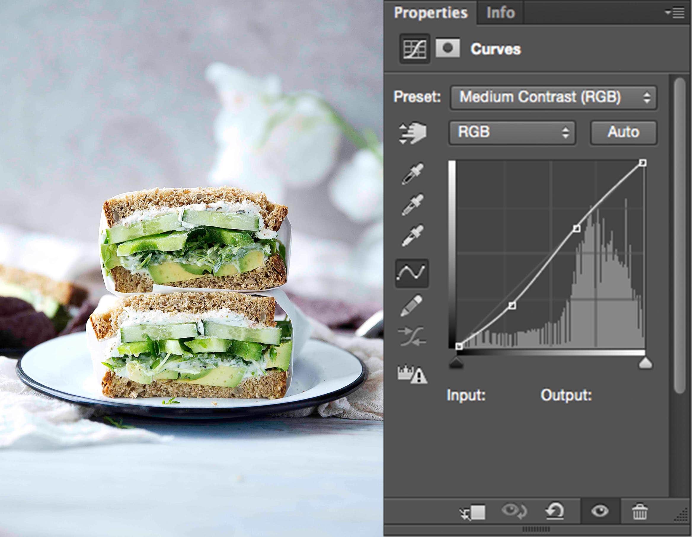
Time to get contrasty. Our image looks good, but in adding our lightening Curve, we’ve lost some of those beautiful blacks. So we’re going to bring some of that back.
Click on the Curves widget, then in the dropdown menu, select “Medium Contrast.”
At this point our image is looking a little harsh. That has a lot to do with the fact that by adding all this light and contrast, we’re inadvertently boosting the saturation. Don’t worry about that too much– we’ll fix it later.
4. Adjust Selective Colors

Our image looks good, but it lacks depth. Instead of adding more general contrast, which would effect our entire image, we’re going to selectively add contrast to our Neutrals and Blacks (adding in black), and selectively add contrast to our Whites (adding in white). Our colors won’t at all be effected by this.
Click on the Selective Color widget. In the dropdown menu, click “Blacks.” Pull the black slider to about +6.
Go back to the dropdown menu and click “Neutrals.” Pull the black slider to about +4.
Go back to the dropdown menu and click “White.” Pull the black slider to about -19.
These aren’t magic numbers; the values should change depending on the image. This is just a rough estimate.
5. Decrease Saturation
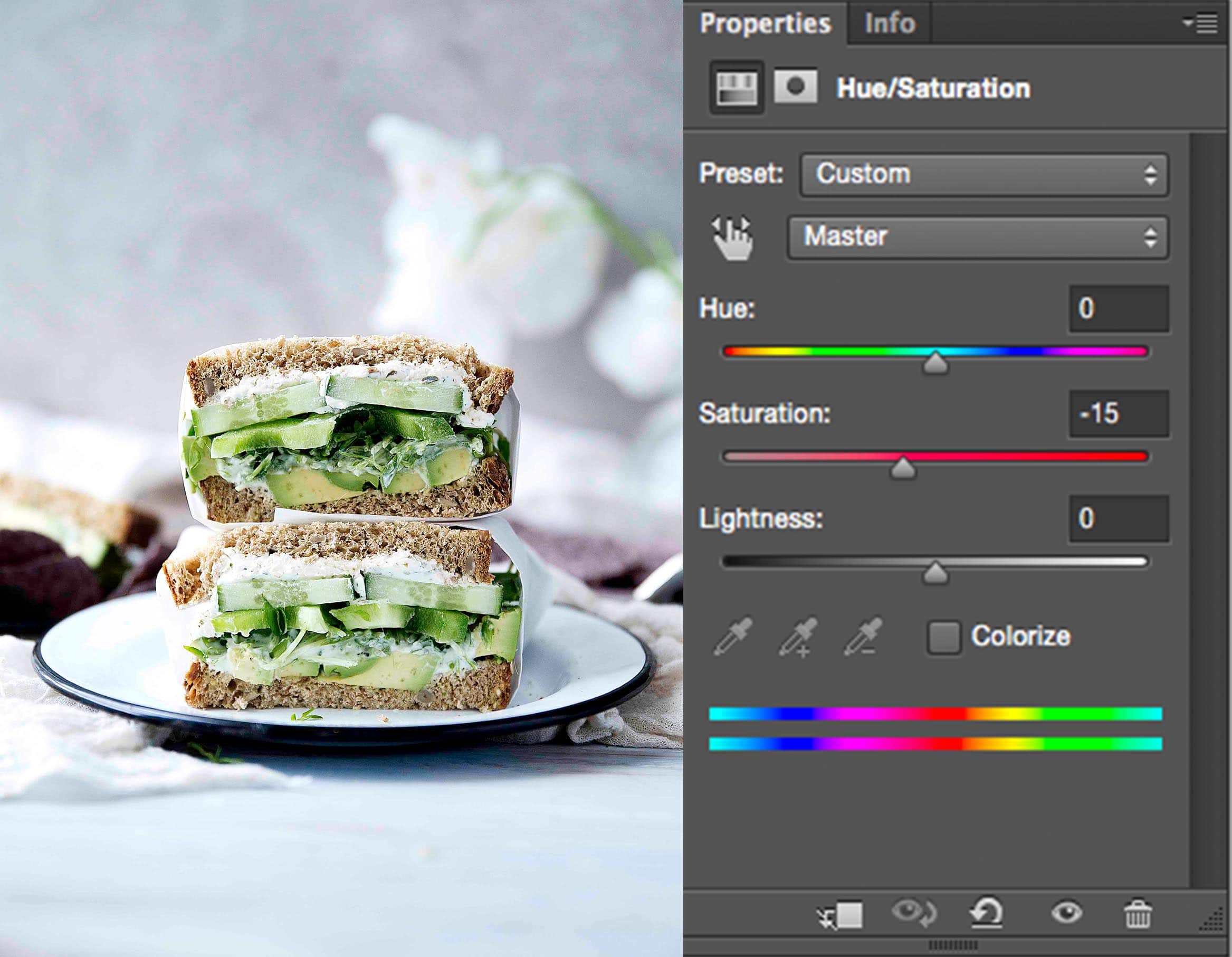
We’re almost there! Now let’s tackle that saturation issue. I love the contrast we’ve added in, but our colors have suffered a bit. The image looks way too saturated. The greens are bright bright bright and the bread looks more yellow than beige. So let’s pull out some of that color.
Click on the Hue/Saturation widget. Pull the saturation slider to around -15. That should about do it.
Before + After
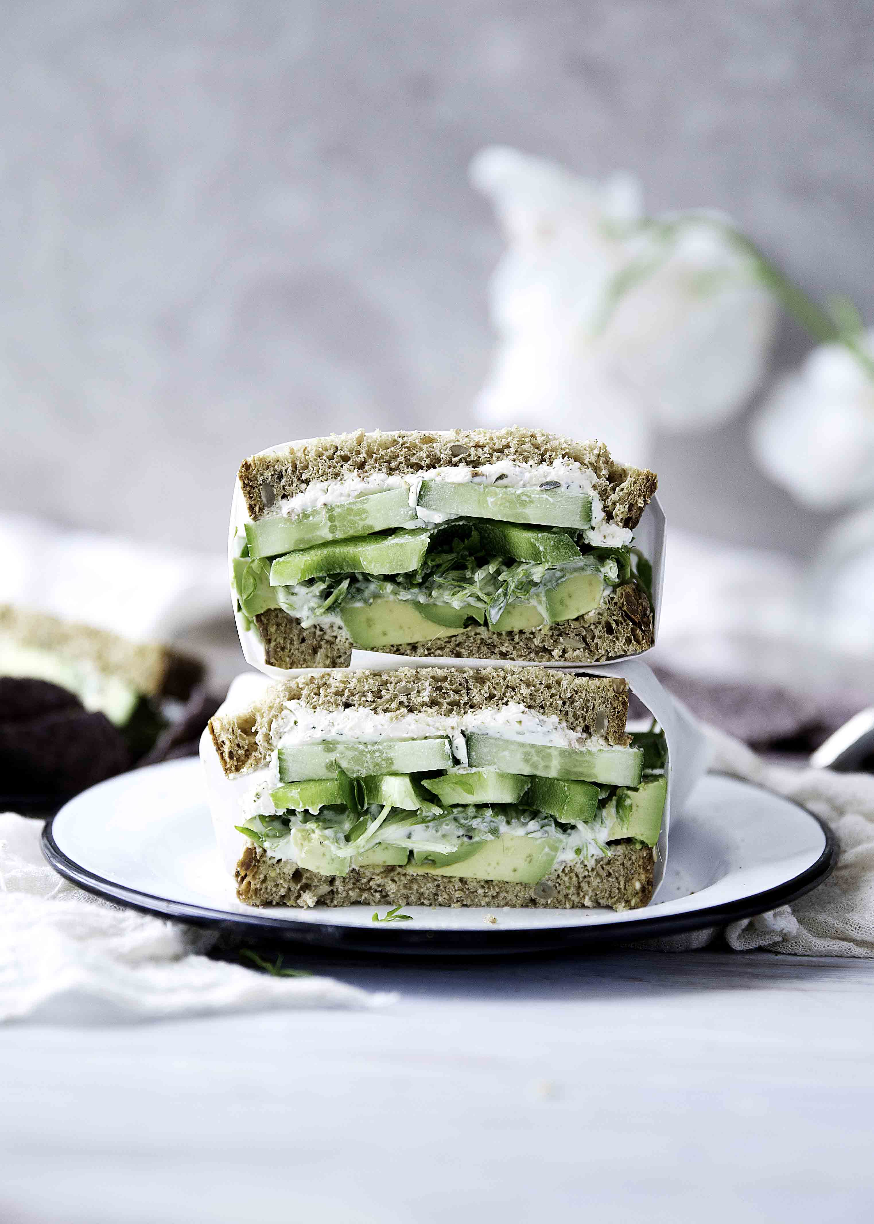
Let’s do a little compare and contrast. Content-wise, the image was good before, but the lighting was nothing special. Compare that with our final image, and the difference is remarkable. We’ve really brought out the natural colors in our image without making things look edited. This image looks how it’s supposed to.
We didn’t alter the image, rather we enhanced and subdued it. Keep that in mind when you’re editing: your goal is to bring out the natural beauty of the image, not to mess with it.
What do you think? I’d love to hear your thoughts! Thanks for following along, and if you have any specific tutorials you’d like to see next, please let me know!!


Love this and so excited about this series!! I’ve been editing my pictures like this for a bit now and am always in love with the results! Thank you so much for sharing your wizardry!!!!
So in-depth and well written, thank you Sarah! Can’t wait for the rest of the series. Love your editing style.
Loved this post, I always wonder how some bloggers make their pics look so bright and beautiful! I’ll use some of these tips next time I edit my pics! 🙂 Thanks for sharing! x
Ariadna || RAWR BOWS